Hartley
Maintaining your reputation
A strategic and design-led Hartley rebrand to reflect growth, build trust, and position the business as a standout property partner in a competitive sector.
Built on reputation
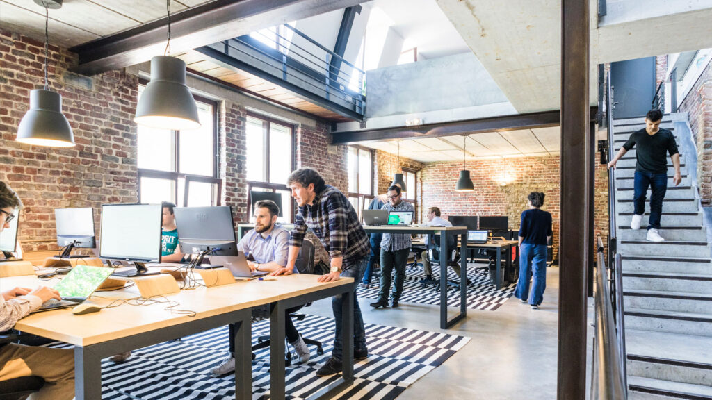
The Hartley rebrand was driven by evolution. As Hartley Property Partners grew, its audience and service offer shifted significantly, leaving the existing branding struggling to keep pace. The business needed a more sophisticated, design-led identity that could match its ambition, reflect its values and stand out in a highly competitive market.
Before any design work began, we carried out in-depth research – analysing competitors, client expectations and stakeholder insight to understand exactly what set them apart. The findings revealed a clear focus on service, trust and professional reputation – qualities that needed to be made visible in the new brand.
Designed to reflect excellence
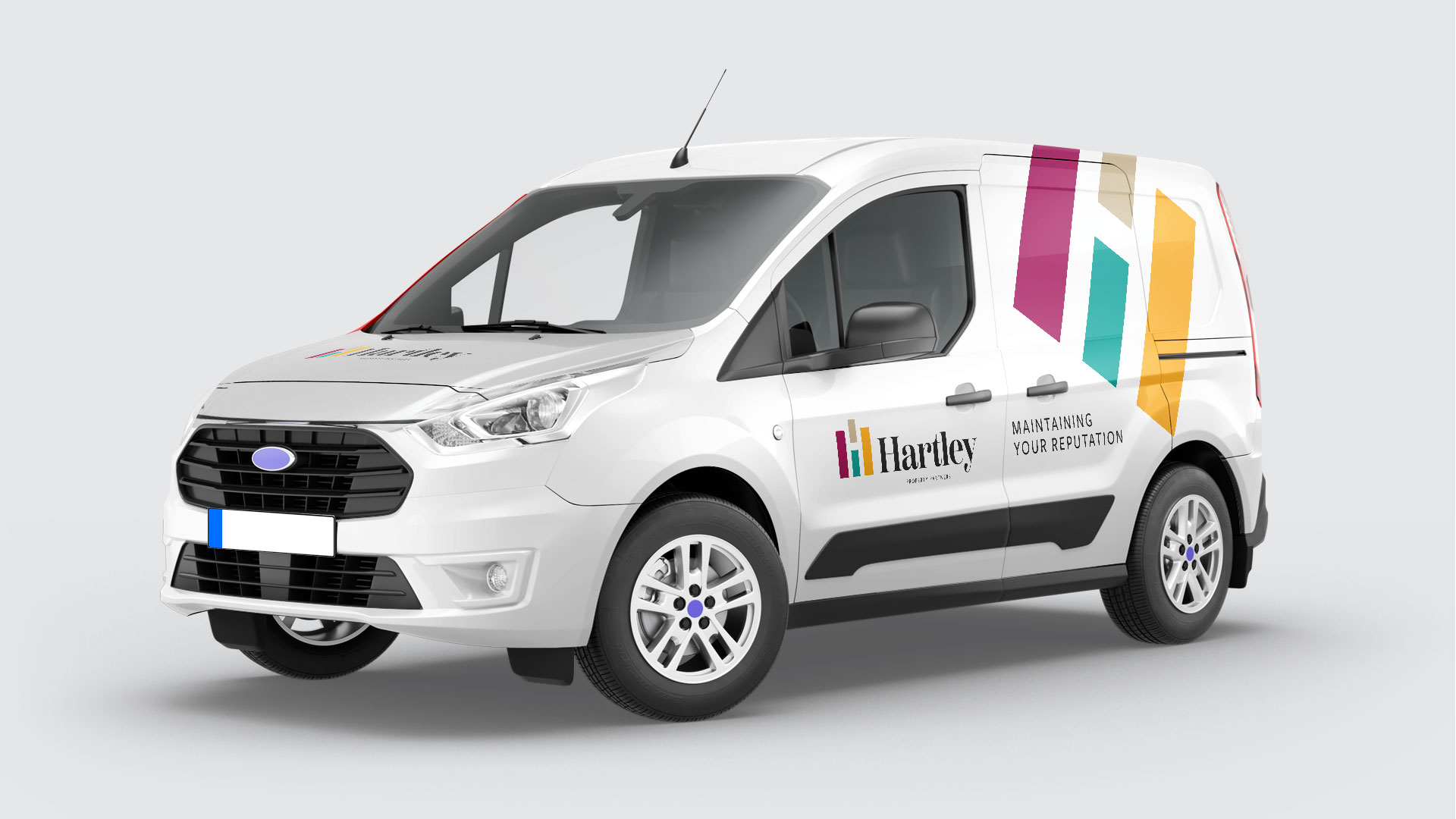
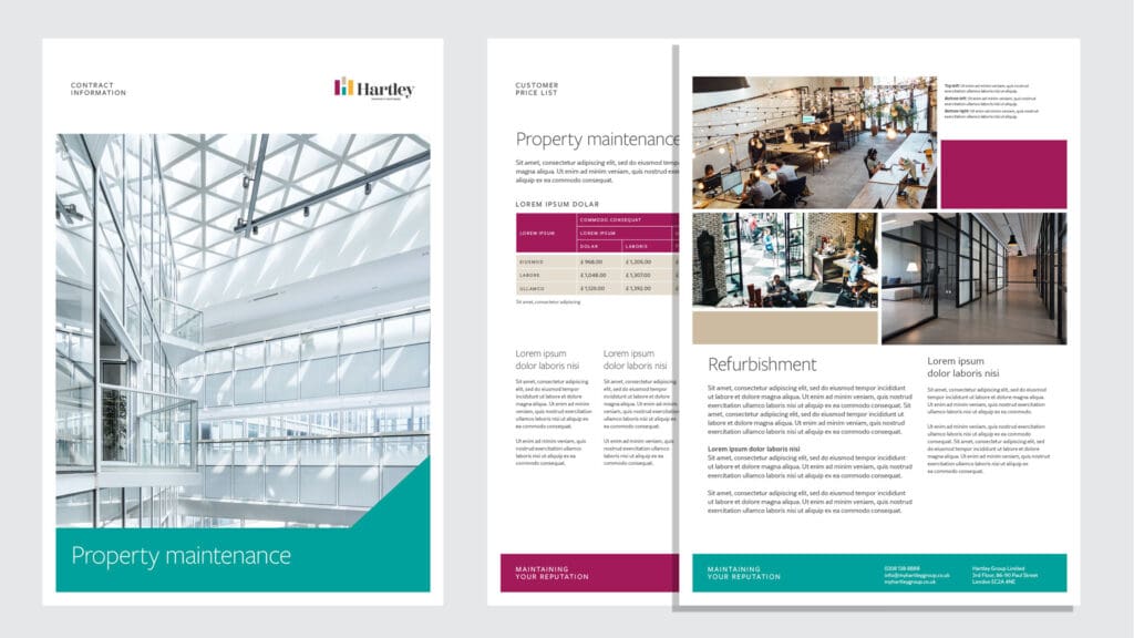
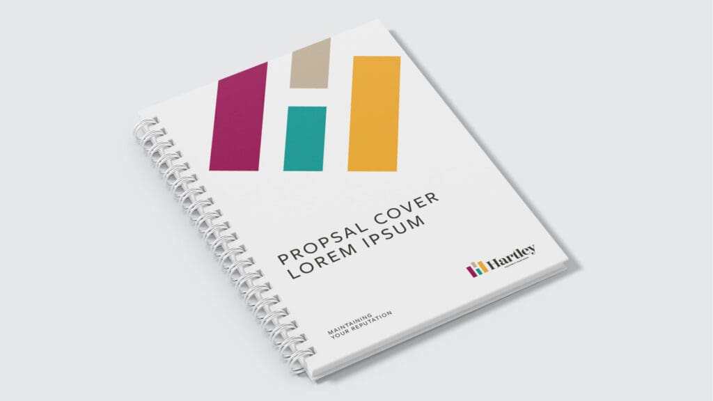
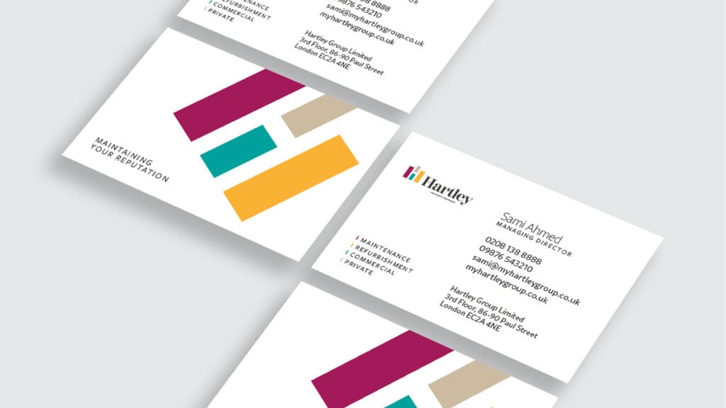
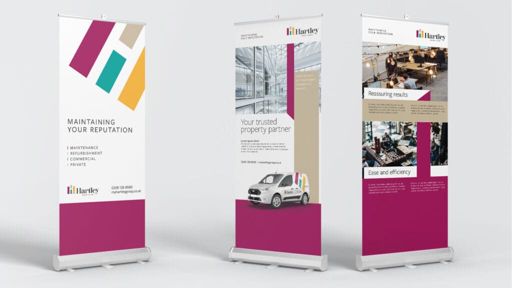
Visually, the identity balances simplicity and distinction. The logo mark combines the ‘H’ from Hartley with a subtle nod to property, avoiding clichés while delivering a confident, modern aesthetic. The refined colour palette signals quality and professionalism while remaining contemporary and accessible.
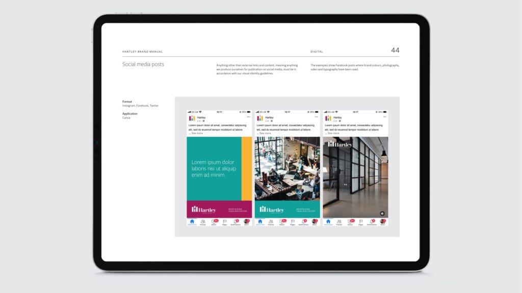
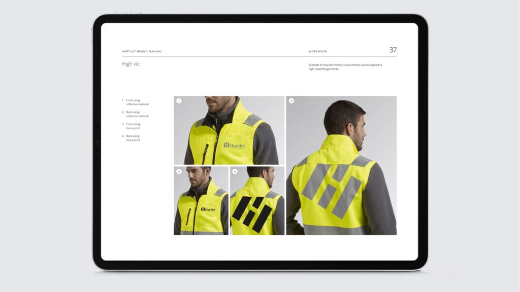
The strapline “Maintaining Your Reputation” became central to the brand, expressing Hartley’s client-focused ethos and reinforcing the trust it’s built over time. Rolled out across all touchpoints – from vehicle livery to uniforms, signage and documentation – the new identity is cohesive, flexible and unmistakably Hartley.
|
About the project |
Details |
|---|---|
|
Client |
|
|
Appointed by |
Forgaard Agency |
|
Roll |
Collaborated with Forgaard Marketing Agency as their design studio |
|
Services |
Brand creation, branding |