Hay Chocolate
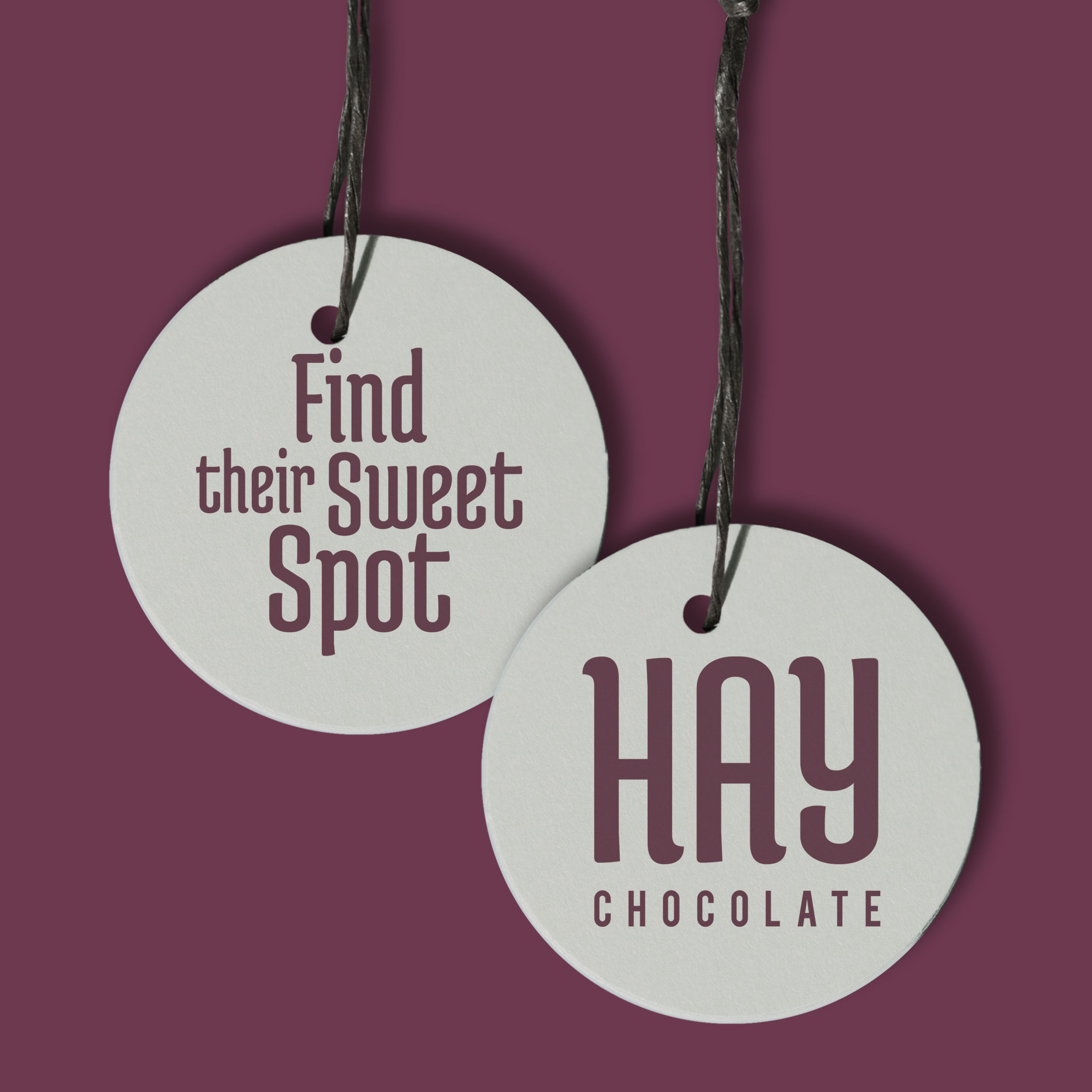
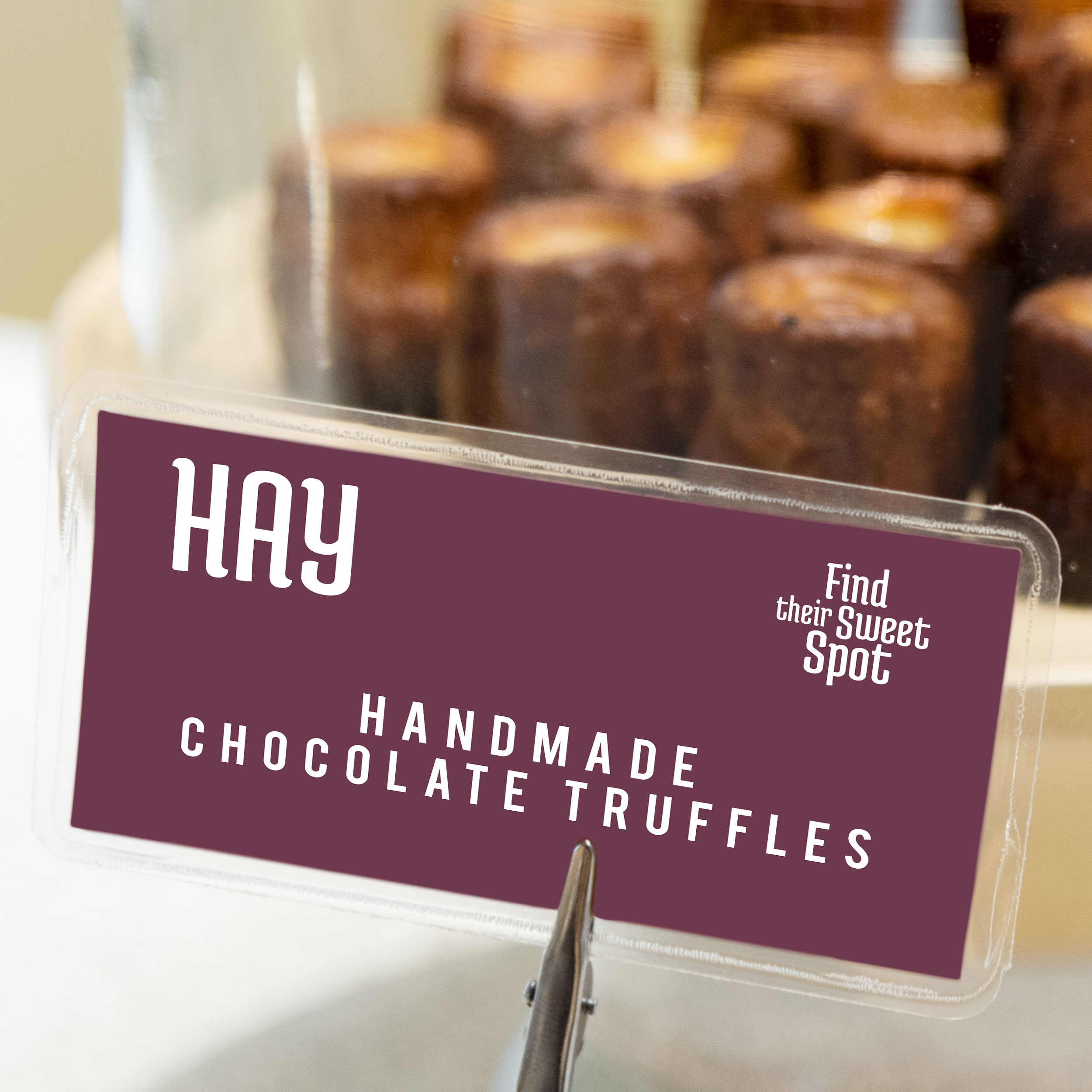
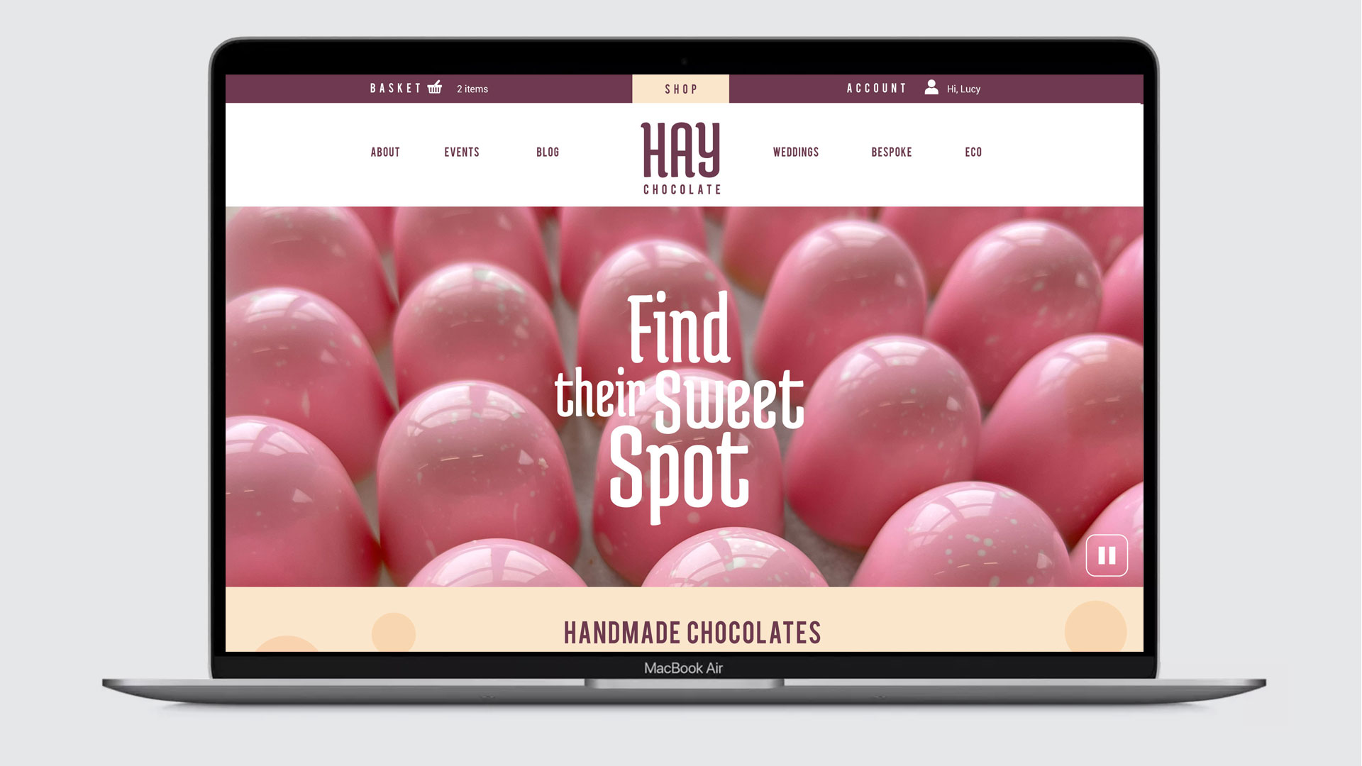
Find their sweet spot
Hay Chocolate rebrand – transforming the brand identity to stand out on crowded shelves and appeal to premium gift shoppers.
Finding the sweet spot
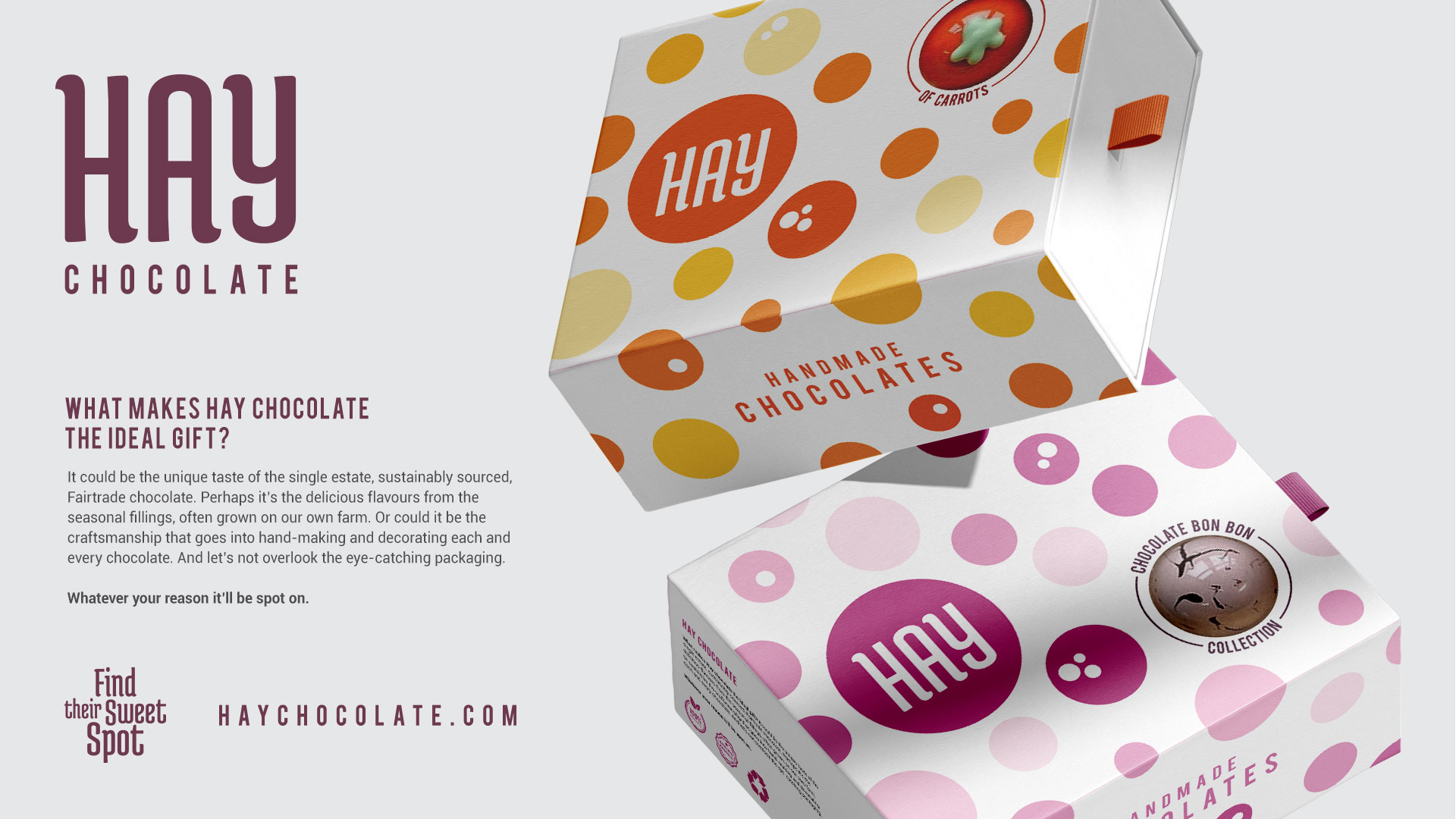
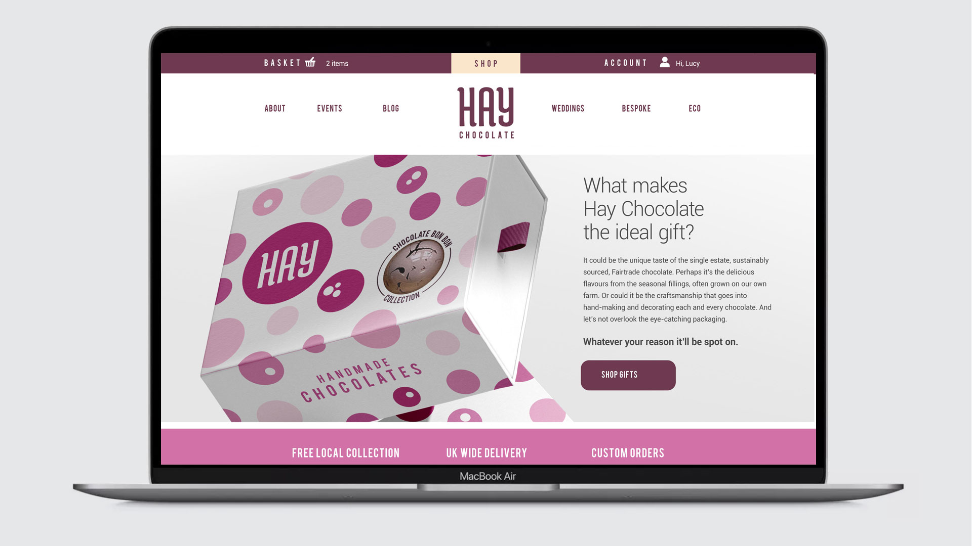
The Hay Chocolate rebrand set out to elevate the brand’s presence in the competitive gift confectionery sector by rethinking its identity and messaging. The goal was to demonstrate how design could shift buyer perception and create a distinctive visual presence on crowded store shelves. Insights from Lucy, the owner, and video content by Sam Pearson of Scafell Media informed a refreshed creative direction.
Research into the premium gifting market – particularly during the cost-of-living crisis – provided a strong foundation for the creative approach, identifying opportunities to communicate value, care, and personality through design.
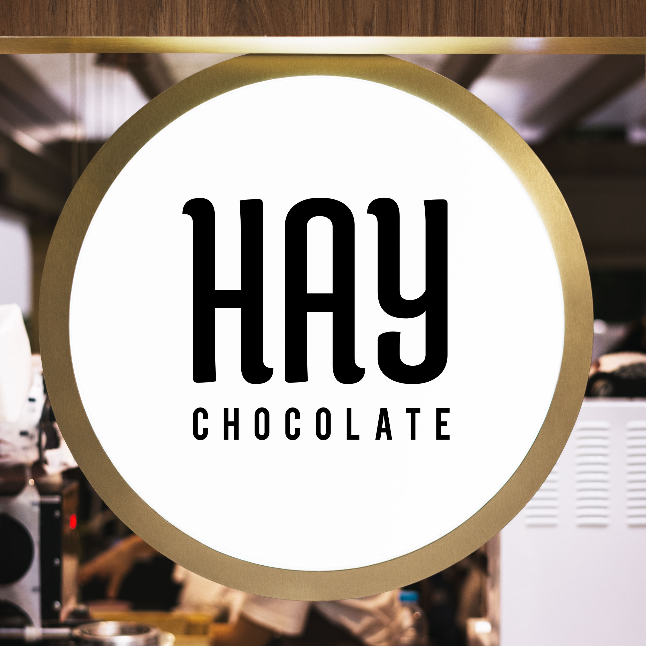
Designed to delight
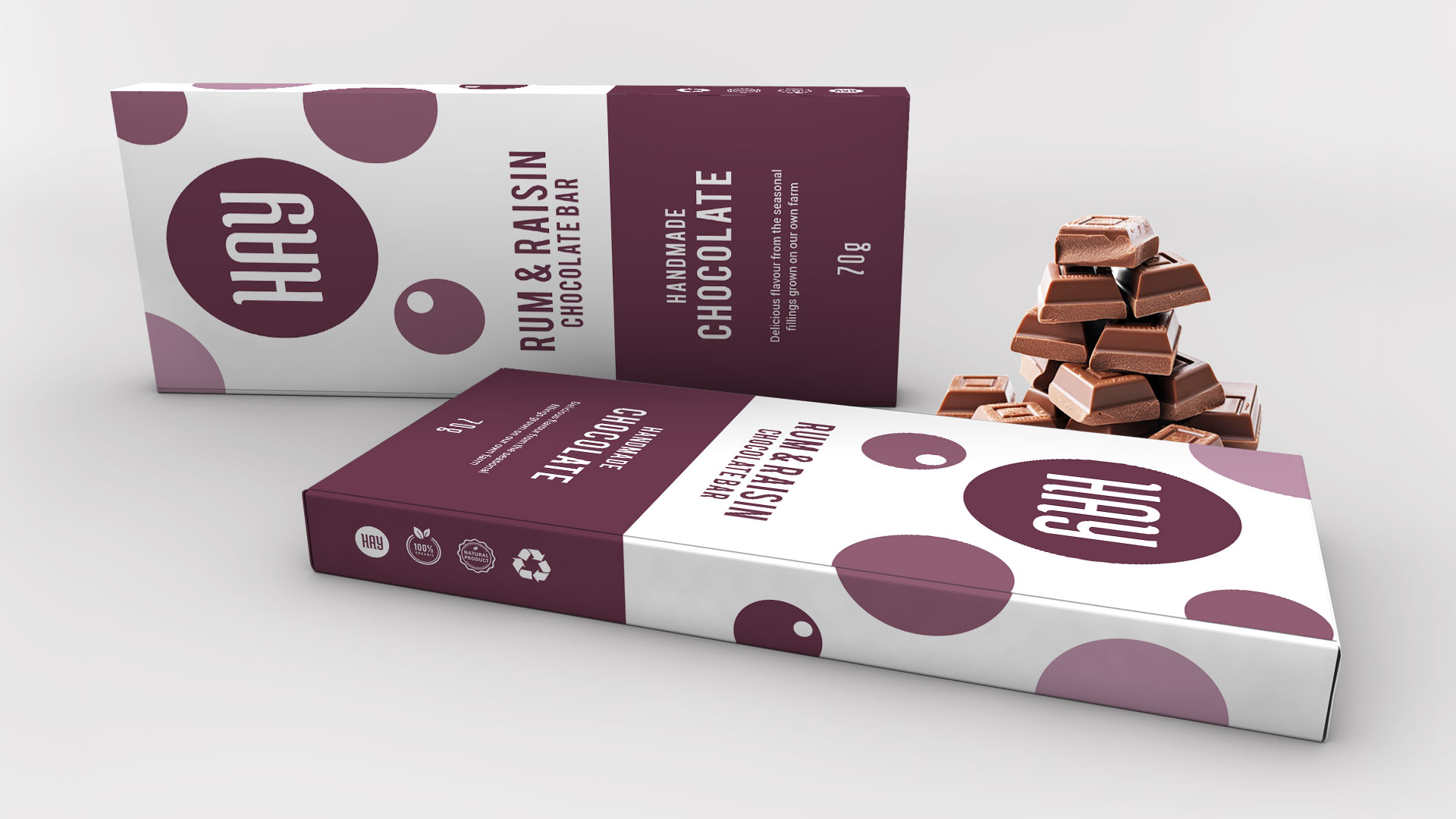
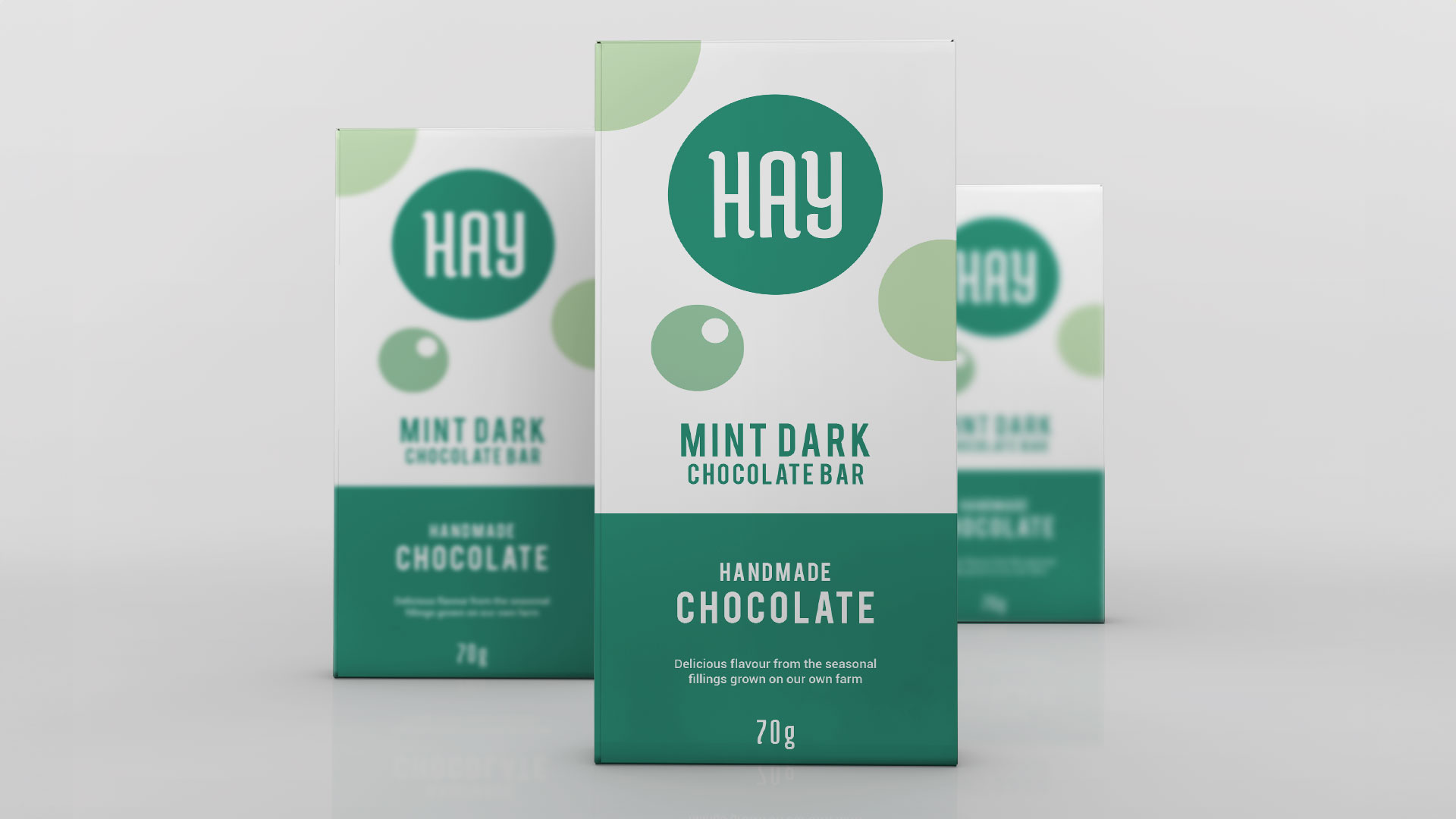
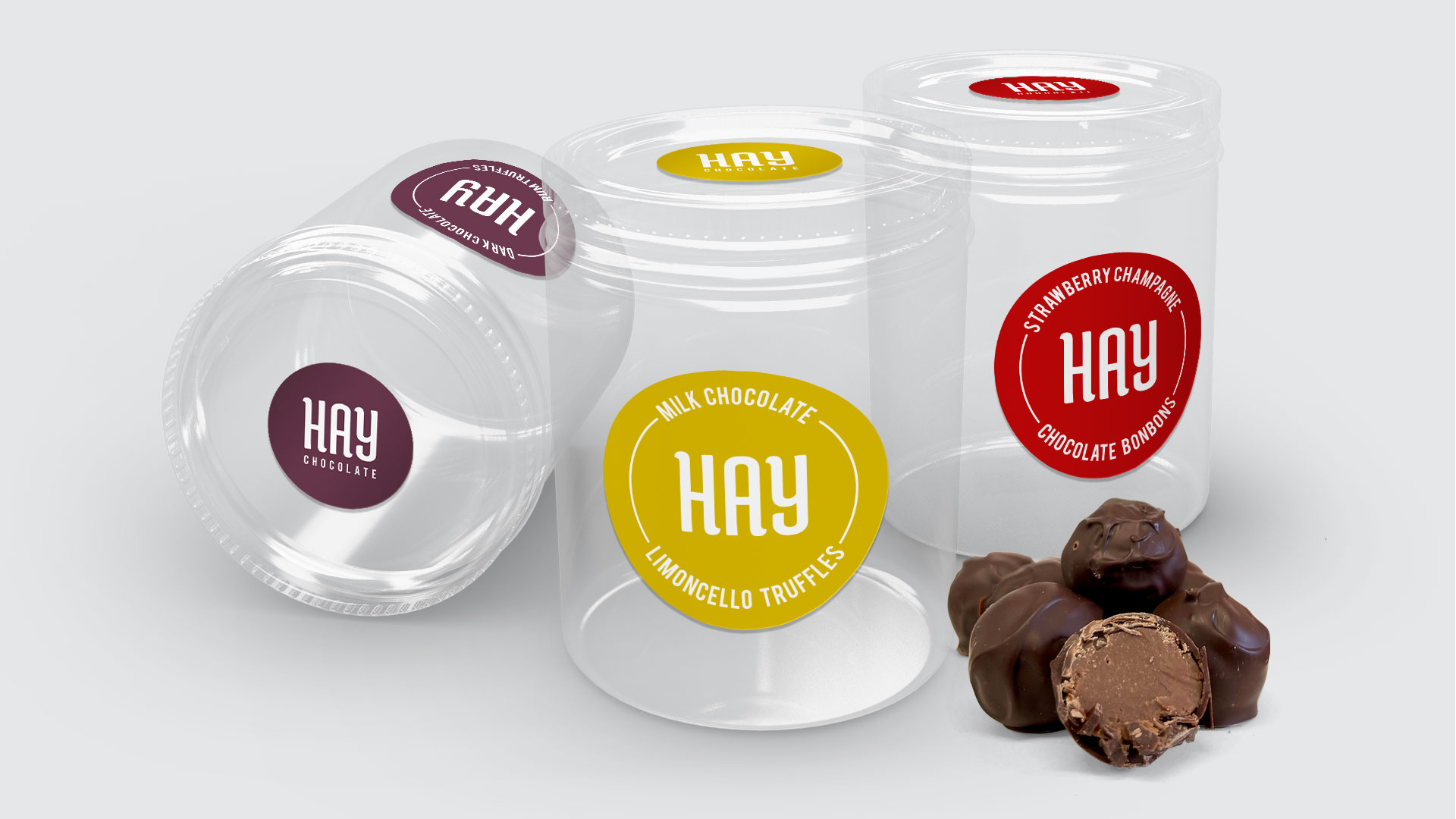
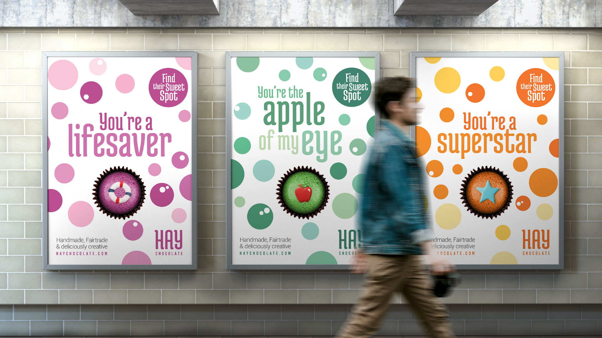
Hay Chocolate’s focus on beautifully decorated bonbons inspired a visual language built around circles and spots – echoed across packaging, copy and campaign assets. The colour palette combined a rich, feminine lead hue with flavour-specific accents, while die-cut windows allowed the product to shine. The unchanged logo was paired with a new strapline, “Find their sweet spot,” which tied the concept together and extended naturally into campaign messaging.
The result was a compelling rebrand that elevated Hay Chocolate’s artisanal quality, enhanced shelf impact, and reinforced its position as a premium, personal gift choice.


Please note: the packaging, branding and designs are concepts only.
|
About the project |
Details |
|---|---|
|
Client |
Hay Chocolate |
|
Appointed by |
Forgaard Agency |
|
Roll |
Collaborated with Forgaard Marketing Agency as their design studio |
|
Services |
Brand creation, branding, campaigns |