Lelley Fields Crematorium
The heart of Holderness
An identity designed to reflect who Lelley Fields Crematorium are as a brand and help them stand out in a highly competitive market.
Designed with sensitivity
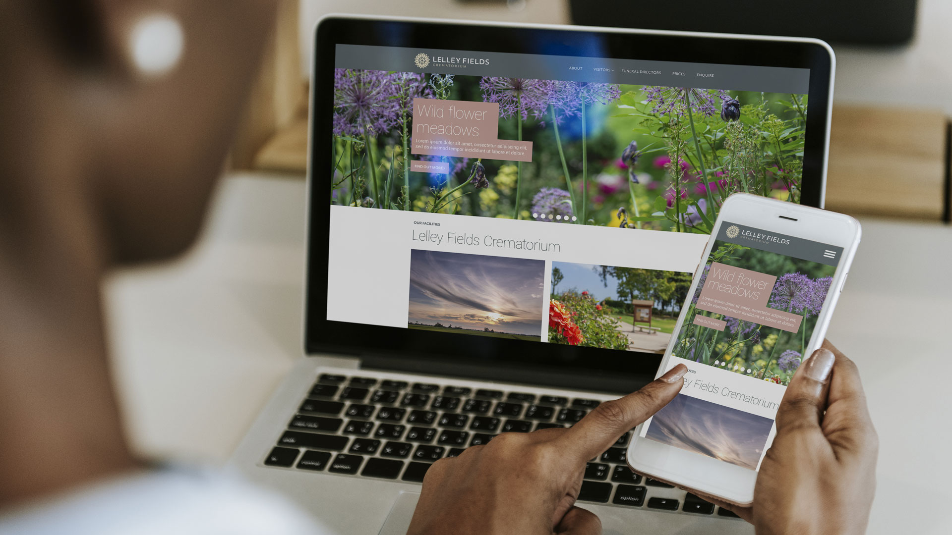
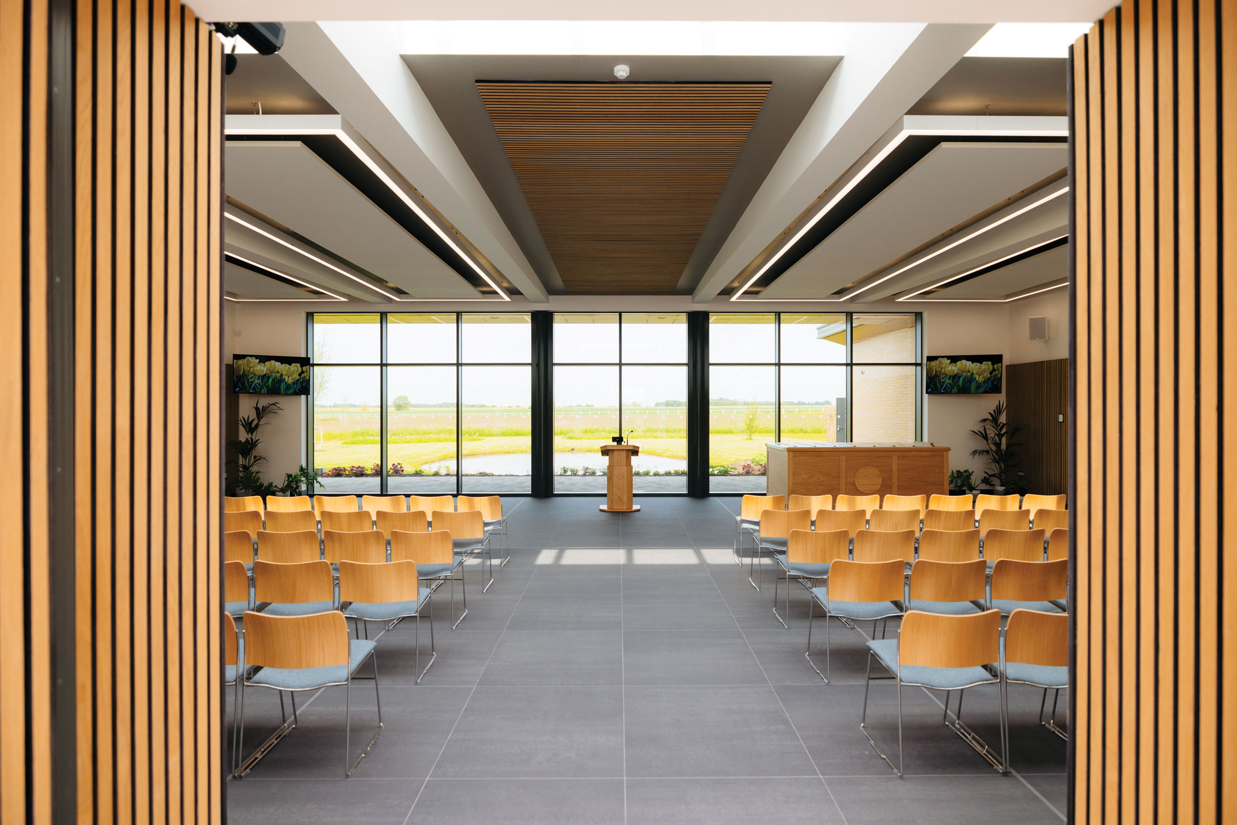
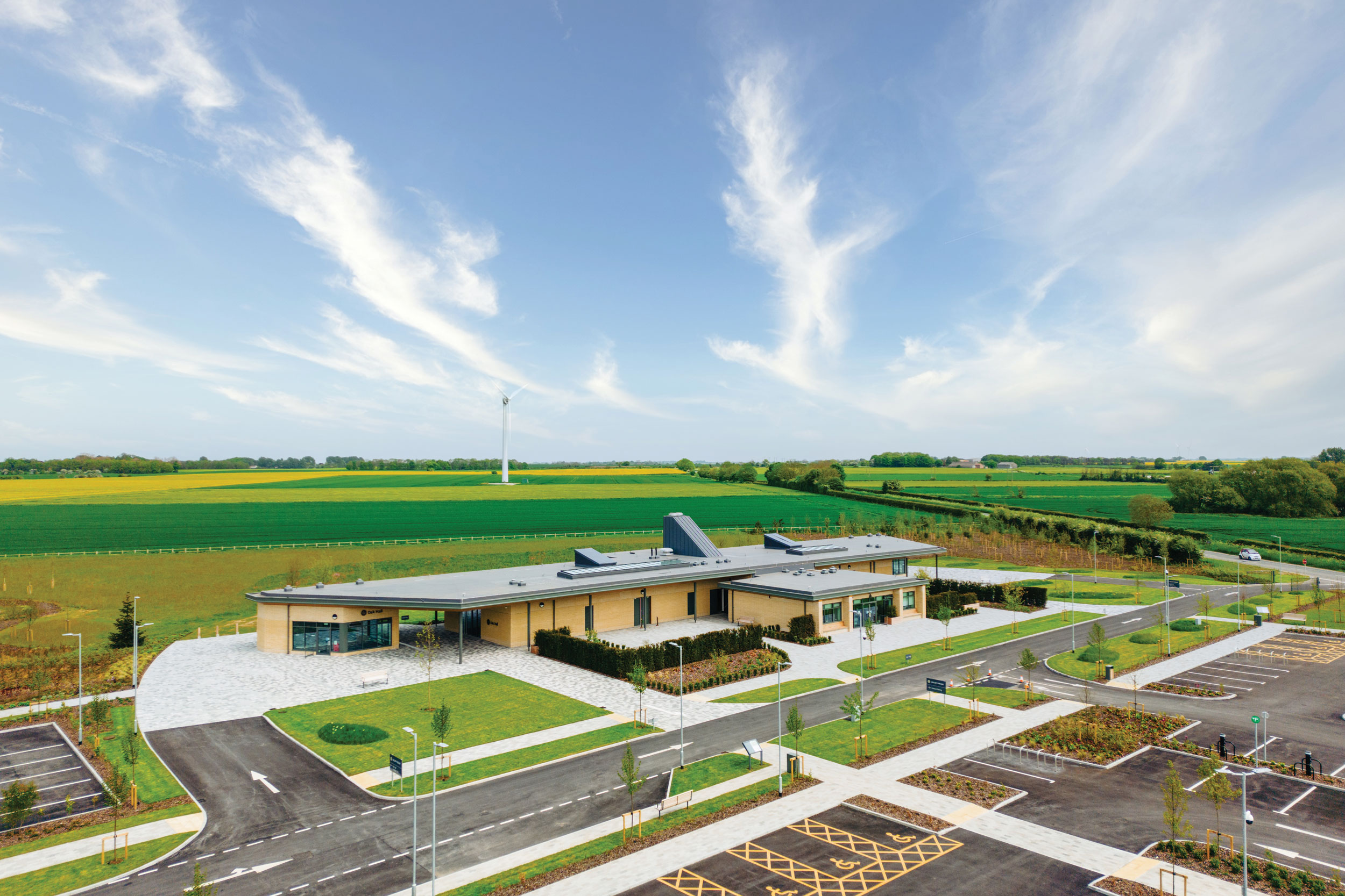
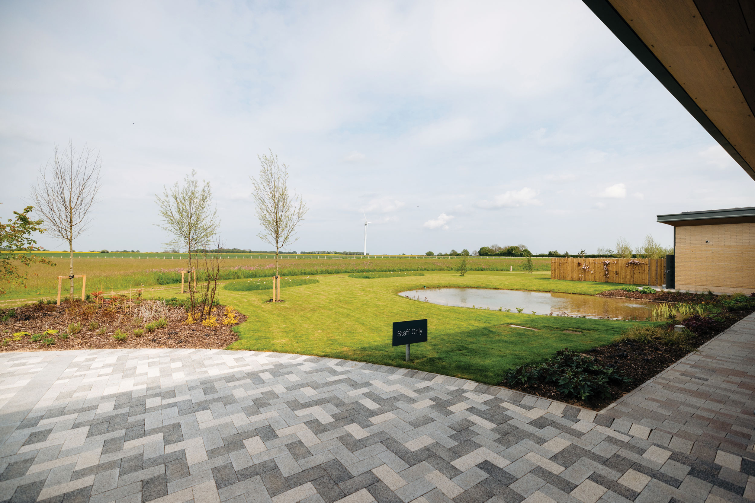
Lelley Fields Crematorium required a brand identity and suite of communications to support the launch of a new, state-of-the-art building in a rural location. The design needed to feel inclusive, accessible, and appropriate for people of all backgrounds and beliefs, while presenting the crematorium as a considered, positive addition to the community.
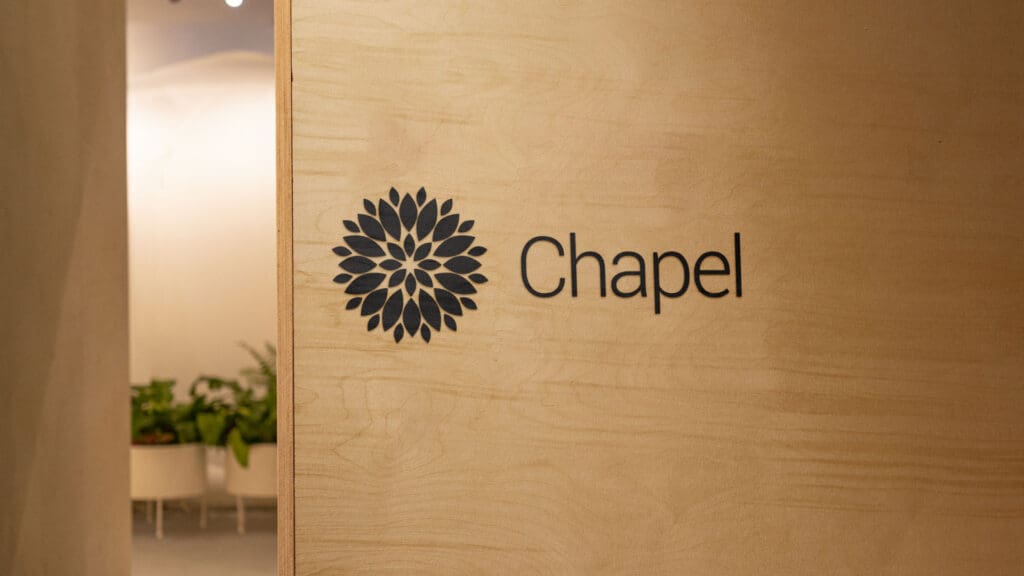
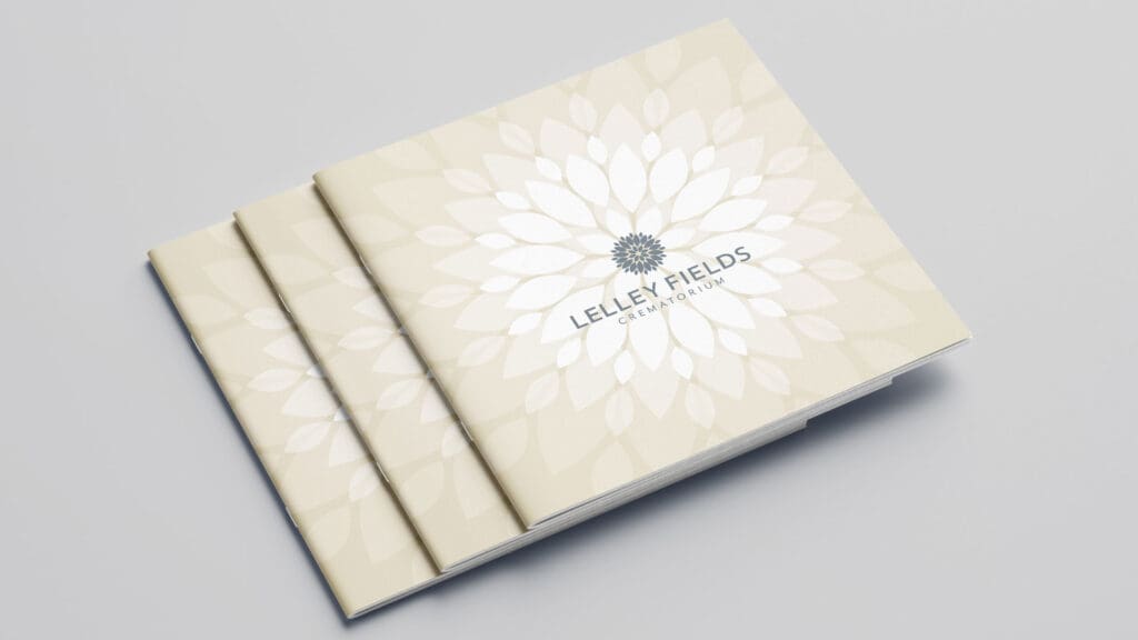
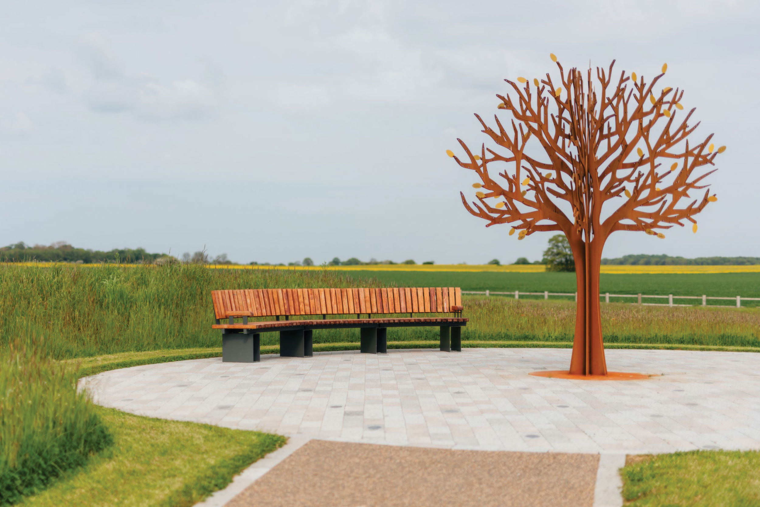
The resulting identity is non-denominational yet spiritual in tone. A modern, timeless font complements a leaf motif that symbolises both new growth and the natural cycle of life. The brand voice focuses on honesty and clarity, using straightforward language that informs rather than obscures – an approach that shaped the design of materials and digital content throughout.
Balancing empathy and function
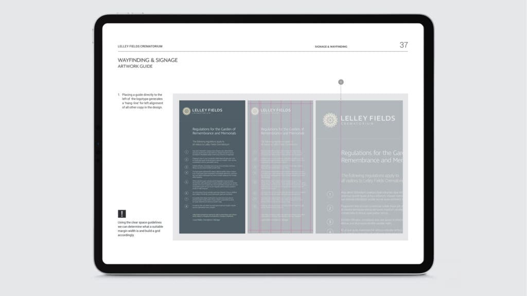
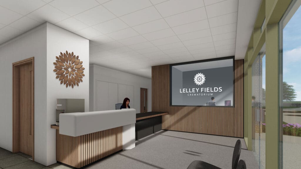
The identity extends across every touchpoint – from architecture and signage to the website and social media. It harmonises with the building’s design, remaining visible without overpowering. A 3D walkthrough on the website allows visitors to explore the spaces in advance, helping families and children understand what to expect.
The digital experience offers direct functionality for Funeral Directors while ensuring ease of use for all visitors. The outcome is a brand that balances sensitivity with practicality – aligning seamlessly with the building’s architecture and earning recognition through a national building award.


|
About the project |
Details |
|---|---|
|
Client |
East Riding of Yorkshire Council |
|
Appointed by |
Forgaard Agency |
|
Roll |
Collaborated with Forgaard Marketing Agency as their design studio |
|
Services |
Brand creation, branding, website design |