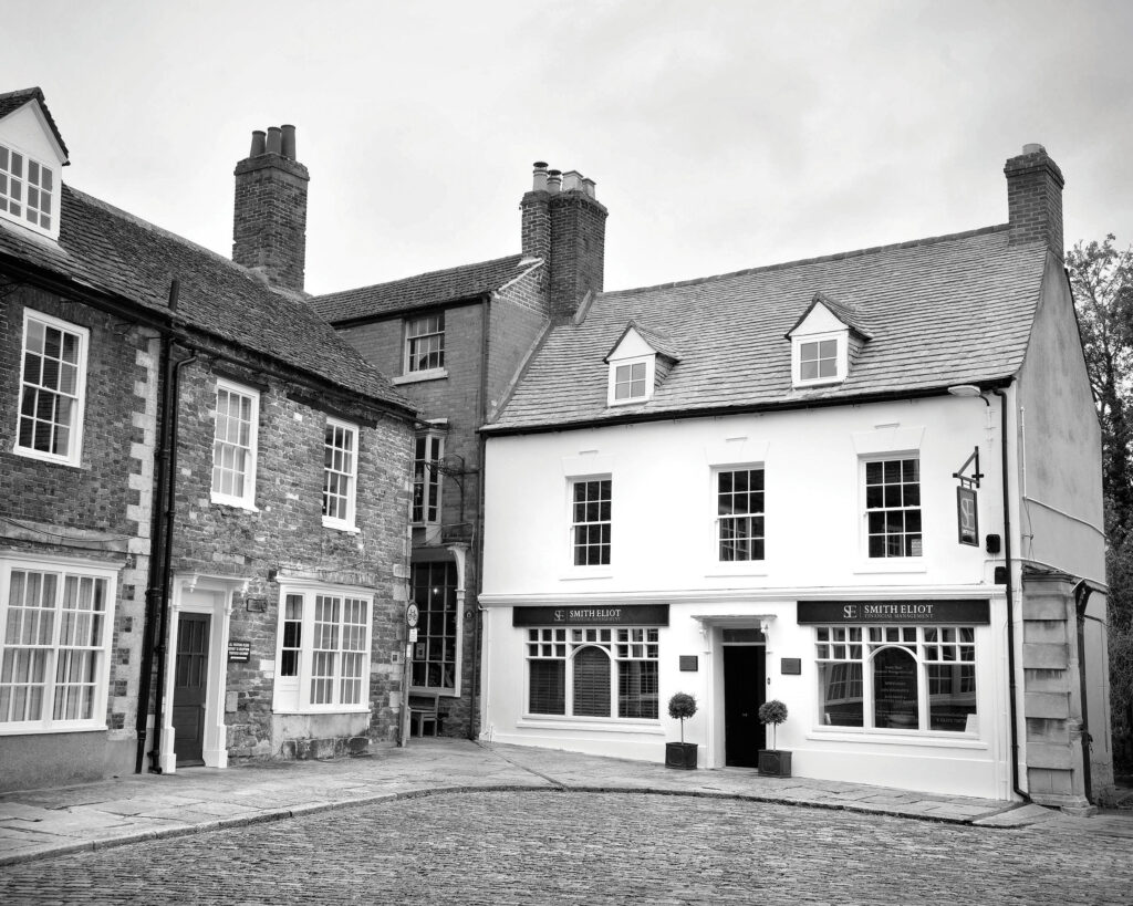
Smith Eliot
Wealth management consultants required a company re-brand to effectively target a younger audience leading with a new brochure design.
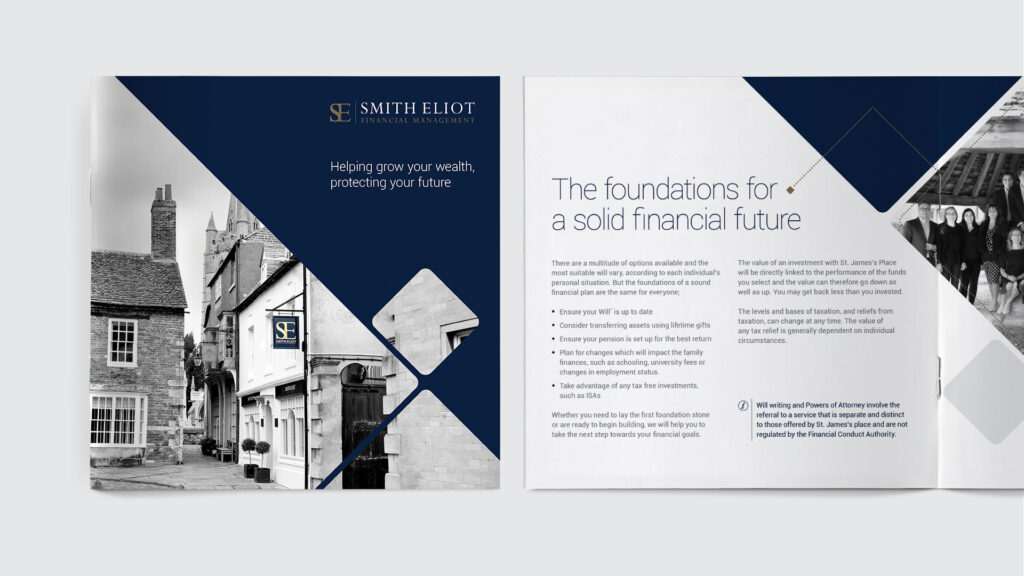
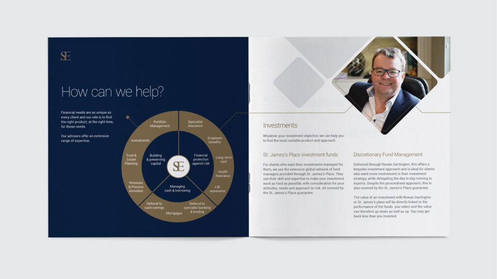
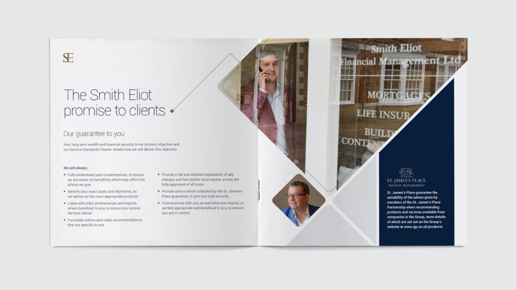
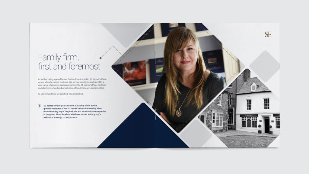
Smith Eliot were looking for a new brochure design that would appeal to a younger audience. As wealth management consultants, their typical customer base is over 65 but they wanted to appeal to a younger demographic. We suggested that not only should they look at a redesign but also introduce a more conversational tone within the copy writing. Information should be kept to a minimum with only the salient points taking priority. Adopting a headline focused structure would allow readers to easily scan information in the way they have become accustomed to online.
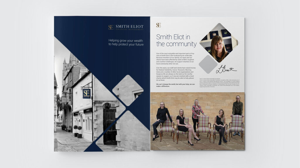
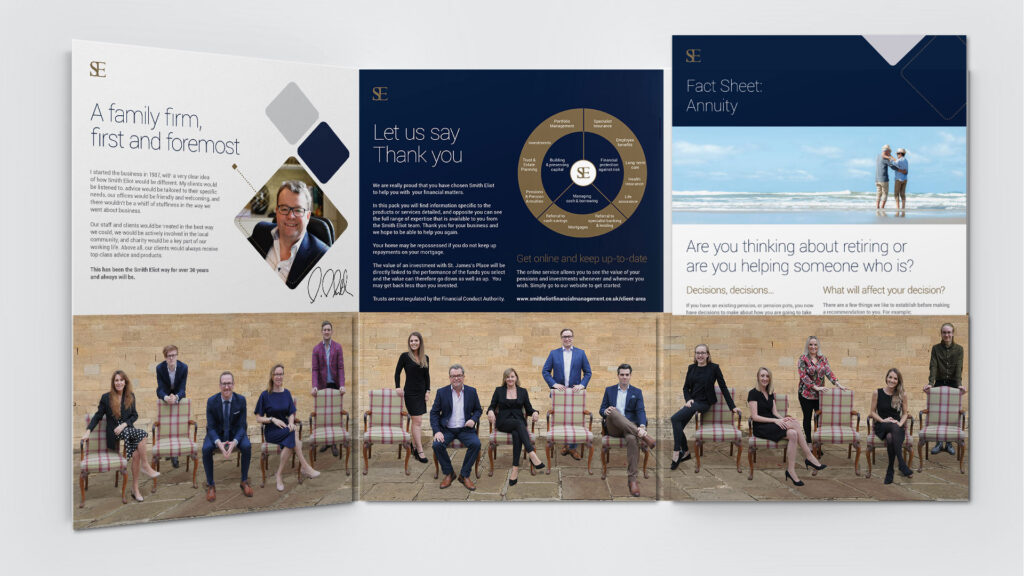
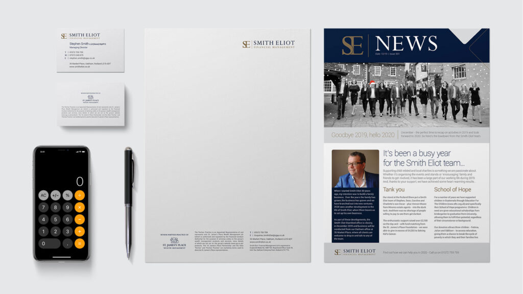
Using newly commissioned photography we focused more on the people in the business rather than its heritage. We used softer shapes to develop a more approachable feel, with a thinner, rounded contemporary typeface for headlines. The Smith Eliot colour palette remained, as did their logo, to retain the company’s brand identity.
The design was applied to a 20 page brochure, six page folder with inserts, newsletter template and a new set of stationery.
| Client | Smith Eliot Financial |
| Business | Financial management consultants |
| Location | Oakham, Rutland |
| Materials | Stationery, brochure, folder and inserts, newsletter |
| Services | Brand creation, marketing collateral, art direction, copywriting |
